Matting
Margins that give the image room
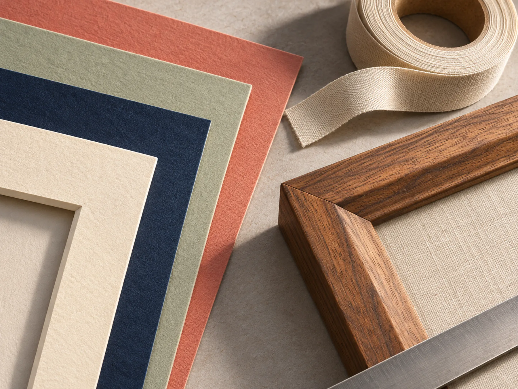
Matboard is the pause between wall and artwork. We cut windows, balance tones, and layer boards when depth helps the eye settle.
Window and reveal
The window opening should follow the art — not crop signatures or bleed edges. We discuss whether the mat overlaps the image slightly or floats it with a narrow gap.
Paper tone
Cool white, warm ivory, and soft gray each shift how ink and pigment read. We hold samples beside the piece instead of choosing from swatches alone.
Warm ivory
Gallery white
Pale stone gray
Deep charcoal accent
Layered mats
A thin reveal in a second tone can echo a color inside the print. We keep layers minimal — enough structure to guide the eye, not a stack that competes with the art.